Why Most Collectors Misjudge the Value of Their Beer Caps

Your Camera Isn't the Problem—Your Light Is
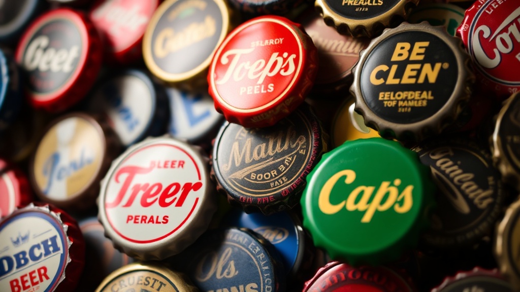
Most collectors think better photos require expensive gear. They don't. I've watched hobbyists drop thousands on macro lenses and ring lights, only to produce images that look washed out and lifeless. The real issue? They're fighting their light instead of working with it. Metal caps—especially vintage ones with embossed lettering or holographic finishes—reflect everything. Point a flash at them and you'll get hotspots that blow out details. Shoot in dim conditions and you'll lose the subtle textures that make each cap unique. This guide covers practical techniques for photographing beer caps that actually look like the objects you're holding—not gray metal discs with indistinguishable markings.
Why bother with quality photography? If you're cataloging your collection for insurance, poor images won't help you prove value. If you're trading or selling, blurry photos kill deals before they start. And if you're documenting rare finds for the broader collecting community, you owe it to fellow enthusiasts to capture details accurately. The methods here work with smartphone cameras, point-and-shoots, or DSLRs. The principles stay the same regardless of your equipment budget.
What Lighting Setup Works Best for Metal Caps?
Direct light is your enemy. When photons hit a curved metal surface at a single angle, they bounce straight back into your lens—creating blown-out spots where detail disappears. The fix is diffused, indirect lighting from multiple angles. You don't need a professional studio. A $15 sheet of white poster board, a desk lamp with a parchment paper diffuser, and a window on an overcast day will outperform a $500 lighting kit used incorrectly.
Set up your shooting area with light coming from at least two directions—ideally three. Think of it as a triangle around your cap. This eliminates harsh shadows and gives the metal dimensionality. Window light works beautifully when clouds act as nature's softbox. If you're shooting at night, bounce your light sources off white walls or ceilings rather than aiming them directly at the subject. The larger your light source relative to the cap, the softer the shadows. That's why professional product photographers use massive umbrellas or diffusion tents—even for tiny objects.
Color temperature matters more than most collectors realize. Vintage caps often feature cream backgrounds, gold foils, or yellowed lacquers that look completely different under warm tungsten bulbs versus cool LED panels. Your camera's auto white balance can compensate somewhat, but inconsistent lighting makes batch editing a nightmare. Stick to daylight-balanced bulbs (5000-5500K) or shoot during consistent daylight hours. If you're mixing light sources—say, a window plus a desk lamp—you'll get color casts that are nearly impossible to correct later.
How Do You Photograph Holographic or Reflective Caps Without Glare?
Holographic caps present a special challenge. Those rainbow finishes that shift from green to purple depending on viewing angle? They're designed to be dynamic—which makes them a nightmare to capture accurately. The trick is controlling your reflection angles. Position your camera so you're seeing the holographic effect at roughly 45 degrees to the light source. This usually preserves some of the color shift without turning the entire surface into a mirror.
For highly reflective commemorative caps—think mirrored silver backgrounds or metallic gold lettering—polarizing filters become worth the investment. A circular polarizer on your lens (or polarizing sunglasses held in front of your phone camera in a pinch) can cut through surface reflections and reveal the printed details beneath. Rotate the filter while looking through your viewfinder or screen. You'll see the glare diminish and the actual graphics become visible. It's like magic, but it's just physics.
Some collectors give up and photograph holographic caps under flat, shadowless light that eliminates all reflection. Don't do this. You lose the very characteristic that makes these caps special. Instead, embrace controlled contrast. Let one side of the cap catch slightly more light than the other. This creates depth and preserves the dimensional quality of embossed elements. Remember—you're documenting a three-dimensional object with history, wear patterns, and manufacturing quirks. Flat lighting erases all of that personality.
Which Camera Settings Produce Sharp, Detailed Images?
If you're using a smartphone, tap to focus on the cap's center, then lock that focus before shooting. Most phones will hunt for focus if you move slightly, and metal surfaces confuse autofocus algorithms. For dedicated cameras, switch to manual focus if your lens allows it. At macro distances, even tiny movements change your focal plane. A tripod isn't optional for serious documentation—it eliminates handshake and lets you use longer exposures in lower light.
Aperture selection involves trade-offs. Wide apertures (f/2.8 or lower) give you blurry backgrounds that make caps pop, but they also shrink your depth of field. At extreme close distances, you might get the cap's edge sharp while the center goes soft. For flat-lay cataloging shots where you need every detail crisp from front to back, stop down to f/8 or f/11. Yes, you'll need more light or longer exposures, but the sharpness gain is worth it. For artistic shots showing a single cap's texture, embrace shallow depth of field—just focus on the most interesting detail, like a brewery logo or date stamp.
ISO is where many collectors ruin otherwise good shots. High ISO introduces noise—those grainy speckles that obscure fine details like tiny text or hairline scratches. Keep ISO as low as your lighting allows. On phones, this means shooting in bright (but diffused) conditions rather than boosting artificial brightness. On cameras, use base ISO (usually 100 or 200) whenever possible. If you're handholding and need faster shutter speeds to avoid blur, add light rather than cranking up sensitivity. Two desk lamps beat ISO 3200 every time.
Backgrounds and Context: What Should Surround Your Caps?
White backgrounds aren't always your friend. Sure, they're clean and look professional in online listings. But white reflects light back onto your subject, potentially washing out pale colors or metallic finishes. For vintage caps with cream or off-white backgrounds, pure white creates harsh contrast that makes the cap look dirtier than it is. Try neutral gray or soft blue-gray instead. These colors absorb excess light and let the cap's true tones show through.
Context matters for certain types of documentation. If you're photographing a cap still attached to its original bottle for provenance purposes, include enough of the bottle to show label details—but not so much that the cap becomes an afterthought. For size reference, include a standard object like a ruler or coin in at least one shot. This prevents disputes about dimensions when trading. Some collectors prefer natural settings—weathered wood, vintage bar tops, brewing equipment. These add character but introduce color casts. If you go this route, shoot a color reference card in the same light for later correction.
Scale becomes important when photographing groups. A grid of twenty caps shot from directly above looks organized but tells viewers nothing about individual characteristics. Instead, shoot collections at slight angles that reveal each cap's curvature. This takes up more frame space but prevents the "puddle of metal" effect where everything looks identical. For insurance documentation, include a handwritten date card in every frame. Digital timestamps can be altered; physical evidence holds up better.
Post-Processing: How Much Editing Is Too Much?
Light adjustments are fair game. Correcting white balance, slightly boosting contrast, or cropping for composition doesn't misrepresent the object. But resist the urge to clone out scratches, dents, or corrosion. These are part of the cap's history and condition. Removing them constitutes misrepresentation if you're selling or trading. I've seen collectors "restore" vintage caps in Photoshop until they look mint—only to face angry buyers when the physical item arrives bearing decades of honest wear.
Batch processing saves time for large collections, but check individual results. A curve adjustment that makes one cap's colors sing might turn another's subtle gradients into posterized bands. When in doubt, process conservatively. You can always add contrast; recovering blown highlights is nearly impossible. Save your originals unedited, then work on copies. Storage is cheap—regret over a lost archival shot is expensive.
For online sharing, export at reasonable resolutions. Massive files slow down websites and don't display any better on screens than modestly sized images. Around 1200 pixels on the long edge works well for most purposes. Include metadata—your name, date, collection details—so provenance follows the image if it gets shared or reposted across collecting forums.