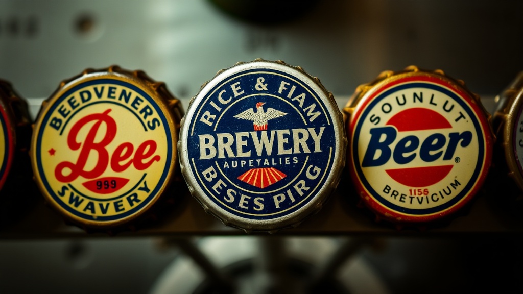
Six Iconic Brewery Logos Found on Vintage Crown Caps

The Classic Red Star Emblem
Victorian Era Script Designs
Mid-Century Modern Minimalist Graphics
Heraldic Crests and Family Seals
The Golden Era Wheat Symbols
Retro Typographic Heavyweight Styles
Have you ever looked at a dented, rusted piece of metal and seen a piece of history? This post examines six iconic brewery logos that have become legendary within the world of vintage crown cap collecting. We'll look at why these specific designs stand out, how to spot authentic marks, and what makes a cap a "holy grail" for many of us.
Collecting isn't just about hoarding metal. It's about the art of the brand. A well-designed logo can survive decades of oxidation and still look striking in a display case. For those of us tracking the history of American brewing, these caps are more than just closures—they are tiny, circular canvases.
What Makes a Brewery Logo Iconic?
An iconic logo is one that remains instantly recognizable even after decades of wear and tear. A great logo uses bold lines, high contrast, and a distinct color palette that survives the aging process of the tinplate or aluminum. Think about the way the Schlitz logo or the old Budweiser script feels—it's heavy, established, and unmistakable.
Designers in the early-to-mid 20th century didn't have the digital tools we have now. They relied on hand-drawn illustrations and heavy typography. This gives vintage caps a certain "soul" that modern, minimalist designs often lack. You'll notice a certain weight to the imagery on a 1950s cap that you just don't see on a modern craft beer cap.
If you're just starting out, I highly recommend reading the art of collecting beer caps to understand the basics of grading and preservation. It helps to know what you're looking at before you start hunting for the big names.
1. The Budweiser Clydesdale (Anheuser-Busch)
The Clydesdale horse is perhaps the most famous mascot in the beverage world. While many modern versions exist, collectors hunt for the vintage iterations where the horse looks more "organic" and less like a digital render. These older caps often feature a more detailed, etched look to the horse's musculature.
Finding an unblemished vintage Budweiser cap is a challenge. Most of them have seen better days—usually due to the way the metal reacts to moisture over time. A clean, red-and-white Budweiser cap from the mid-century is a staple for any serious collection.
2. The Pabst Blue Ribbon Seal
The Pabst Blue Ribbon logo is a masterclass in simplicity. It's a blue ribbon, a circular seal, and a very specific type of serif typography. Because the brand has such a long history, there are thousands of variations, but the vintage "PBR" caps are the ones that hold real value. Collectors look for the specific weight of the printing; if the ink looks too thin or "flat," it might be a later, cheaper reproduction.
Worth noting: The simplicity of this logo makes it a great candidate for certain types of display. If you're building a display, you might want to check out my guide on constructing a professional-grade wall grid to ensure these pieces are showcased properly.
3. The Miller High Life "Champagne of Beers"
The gold-and-red color scheme of the Miller High Life logo is unmistakable. The "Champagne of Beers" slogan is a piece of Americana that carries a lot of weight in the collector community. Older versions of this cap often feature more intricate gold-colored foil-style printing that has a much higher-end feel than the standard white-and-blue versions.
The catch? These are incredibly common. Because Miller is so ubiquitous, finding a "perfect" specimen is actually harder than finding a "rare" one. You want the one with no rust-induced discoloration on the edges. That's the real test of a collector's eye.
4. The Coors Banquet Gold
Coors Banquet has a very distinct, old-school aesthetic. The logo often features a more rugged, western-inspired font that feels much more "authentic" to the American West. The gold-colored caps are particularly striking when displayed under LED lights. They have a way of catching the light that makes the whole collection pop.
It's a bit of a game to find the specific "Banquet" variations that haven't been heavily weathered. Many of these were found in barns or old cellars, meaning they've had plenty of time to oxidize. A clean, gold-toned Coors cap is a trophy.
5. The Guinness Harp (Global Icon)
While Guinness is an Irish stout, their logo—the Celtic harp—is a global icon found on many different types of closures. The harp is a beautiful, intricate design that shows off the precision of vintage printing. It's a more "elegant" cap compared to the bold, blocky logos of American lagers. It's a bit more delicate, so be careful when handling them.
If you're looking for technical details on how these logos were historically produced, the Wikipedia page on crown caps offers a great deep dive into the history of the design itself. It's fascinating to see how a simple piece of metal evolved.
6. The Schlitz "Golden Schlitz" Logo
Schlitz was once the king of the Midwest, and their branding reflects that. The logo is heavy on the gold and the classic serif fonts. For collectors, the "Golden Schlitz" era is the gold standard (pun intended). These caps often have a very high level of detail in the fine lines around the central crest.
Finding an original, un-dented Schlitz cap is a high-tier win. Most of these were part of much larger, high-volume distributions, so the scarcity isn't in the brand itself, but in the condition of the vintage metal.
How Much Do Vintage Brewery Caps Cost?
The price of a vintage brewery cap varies wildly based on three factors: rarity, condition, and the brand's current status. A common-brand cap in "Good" condition might only fetch a few dollars, while a rare, niche brewery cap in "Mint" condition can go for significantly more. There isn't a fixed price list because the market is driven by collectors, not a centralized exchange.
To give you a better idea of the market, I've put together a rough comparison of what to expect:
| Logo Type | Typical Rarity | Condition Impact | Collector Value |
|---|---|---|---|
| Standard American Lager (Bud/Miller) | Common | High | Low ($1 - $5) |
| Regional/Niche Brewery | Uncommon | Very High | Medium ($10 - $30) |
| Vintage/Pre-War Era | Rare | Extreme | High ($50+) |
| Limited Edition/Promotional | Varies | High | Variable |
When you're buying or selling, always look closely at the edges. A tiny bit of rust on the rim might not seem like a big deal, but it's a huge deal to a serious collector. It's also a good idea to learn how to identify authentic vintage brewery marks so you don't get stuck with a modern reproduction. A lot of people try to pass off modern, high-quality replicas as vintage, and it's easy to get fooled if you don't know what to look for.
One thing I've learned over the years is that the "story" of the cap matters. A cap that comes from a specific, defunct brewery is always more interesting than a generic one. If you can find a cap from a brewery that no longer exists, you've found something special. That's where the real history lies.
Always keep your eyes peeled during your travels. You never know when you'll find that one piece that completes your set. Whether it's a dusty corner of an antique shop or a specialized auction, the hunt is half the fun. Just remember to check the authenticity of the metal and the ink before you commit.