Lighting Techniques for Showcasing Your Metal Cap Collection

You’ve just finished arranging a rare set of vintage copper-toned crown caps in a display case, but when you turn on the overhead light, the metal looks dull and flat. Instead of that brilliant metallic sheen that makes a collection pop, the caps look like ordinary pieces of scrap metal. This happens because light hits metal surfaces in complex ways—reflecting, refracting, and creating harsh glares that can actually hide the very details you want to show off. This post breaks down how to manage light angles, color temperature, and shadow control to make your metal cap collection look professional.
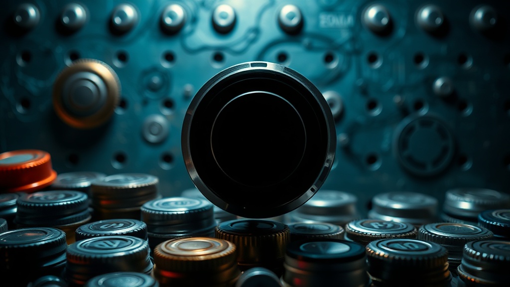
Metal caps are tricky. Unlike plastic or paper-labeled caps, metal is highly reflective. If you use a single bright bulb, you'll get a "hot spot" of blinding white light that obscures the logo. If your light is too dim, the colors look muddy. Getting it right requires a bit of strategy.
What is the Best Light Temperature for Metal Displays?
The best light temperature for displaying metal caps is a "neutral white" or "cool white" light, typically ranging between 4000K and 5000K. This prevents the metal from looking too yellow (which happens with warm incandescent bulbs) or too blue (which can happen with cheap LEDs). A neutral light preserves the true color of the printed graphics and the actual hue of the metal itself.
If you are displaying a collection of brass or gold-toned caps, you might be tempted to use warm light to make them "glow." Don't do it. Warm light can make a high-quality gold cap look like cheap, weathered bronze. By using a neutral temperature, you allow the viewer to see the actual material quality.
When selecting bulbs or LED strips for your display case, check the Kelvin (K) rating on the packaging. For those interested in the science of light, Wikipedia's entry on color temperature provides a deep dive into how different light-emitting sources affect human perception.
Light Source Comparison
| Light Source | Pros | Cons |
|---|---|---|
| LED Strips | Low heat, long life, adjustable color. | Can look "cheap" if not diffused. |
| Halogen | Excellent color rendering. | Generates high heat; can damage caps. |
| Fluorescent | Even light distribution. | Often has a greenish tint. |
| Natural Sunlight | The most beautiful light. | Unpredictable; causes UV damage. |
One thing to watch out for is heat. Metal caps, especially those with older paint or lacquer, can react to heat over time. If you use a high-wattage bulb inside a closed glass case, you're essentially creating a small oven. This can lead to discoloration or even the peeling of the printed design. Stick to LEDs to keep the temperature stable.
How Do I Avoid Harsh Glare on Shiny Caps?
You avoid harsh glare by using diffusion and multiple light angles rather than a single direct light source. Instead of pointing a spotlight directly at your caps, you want to bounce the light or pass it through a medium that softens the edges of the light beams.
Direct light hits the curved surface of a crown cap and bounces straight into your eyes. It’s distracting. To fix this, try these three methods:
- Use Diffusers: If you're using LED strips, look for "COB" (Chip on Board) LEDs or use a frosted acrylic strip over them. This spreads the light out so you don't see individual "dots" reflected in the metal.
- Angle the Light: Never place a light source directly above or directly in front of the collection. Instead, angle your lights from the sides or even from the bottom (if using a glass shelf). This creates a "grazing" effect that highlights the texture without the blinding reflection.
- Indirect Lighting: Point your lights at a nearby surface rather than the caps themselves. The light will bounce off the wall or the back of the case, creating a soft, ambient glow that fills the shadows.
I once spent three hours trying to photograph a set of silver-toned Heineken caps under a desk lamp. The results were terrible—just bright white flashes everywhere. It wasn't until I used a piece of white parchment paper to diffuse the light that the logos actually became visible. It's a small change, but it makes a massive difference.
Before you start displaying, make sure your caps are pristine. Any fingerprint or smudge will be magnified by the light. I highly recommend using microfiber cloths for dusting metal caps to ensure they are spotless before you turn on the lights.
Does Light Exposure Damage My Collection?
Yes, prolonged exposure to UV light and high heat can damage the pigments in your metal caps. While the metal itself is durable, the printed graphics—especially the inks used on vintage or specialty brewery caps—are susceptible to fading and oxidation.
UV rays from the sun or certain types of high-intensity discharge lamps can break down the chemical bonds in the ink. This leads to "sun bleaching," where your vibrant red or blue logos turn a pale, washed-out version of their former selves. This is particularly true for older, more fragile pieces.
To protect your investment, consider these steps:
- Avoid Window Placement: Never place your display case in direct sunlight. Even if the glass is UV-protected, the sheer heat and intensity of the sun can be problematic.
- Use UV-Filtering Glass: If you are building a custom display case, look for museum-grade acrylic or glass that blocks UV rays.
- Monitor Heat: If your display case feels warm to the touch, your lighting is too intense. Heat can cause the metal to expand and contract, which might eventually lead to micro-cracks in the lacquer or paint.
If you're worried about the condition of your pieces, you should also be mindful of how you handle them. If you've recently cleaned a piece to get it ready for display, ensure you followed proper protocols for removing stubborn residue without damaging metal finishes. A clean surface reflects light much more predictably than a dirty one.
The goal isn't just to make them "bright." The goal is to make them visible. A well-lit collection should feel like a gallery, not a neon sign. You want the viewer to see the embossed texture of the metal and the sharp edges of the brewery's logo without being blinded by a glare.
When you're setting up your display, don't be afraid to experiment. Turn the lights on, walk to the other side of the room, and see how it looks from a human perspective. If it looks too "busy" or "flashy" from a distance, you need more diffusion. If the shadows are too dark, you need more light sources at lower intensities. It's a balancing act, but once you find that sweet spot, your collection will look incredible.